Welcome to the Bella Signature Design Blog!

We are so happy that you came to visit our blog! Bella Signature Design focuses on creating a custom, stylish event that is highly personal, with details that synergistically come together to create an atmosphere that is a direct reflection of you. My passion, as a designer, is to infuse your event with all the little things that speak to who you are, and to share that with your guests in a stylish, unexpected way. Our blog will be changing in the next few weeks to reflect our vision and our passion, so hang on for the ride and enjoy!

Feel free to peruse the posts, look in our archives for some great advice and be sure to leave comments on what you like. We love hearing from you!
Showing posts with label color palette. Show all posts

Monday, November 16, 2009

Leah and Adam part 2, Before and after

Leah and Adam's wedding was full of glamour, fun and color! Their venue, the newly remodeled Lynnwood Convention Center, wasn't the typical wedding venue, which made it all the more fun for me to transform. Here are a few before and after shots of Leah's venue:
(shot by Azzura Photography)
(even their before pictures are better than mine!) :)


and a photo from my Iphone, with just a few tables in the space...


The room above was used for the ceremony, are you ready for the transformation??


Image by Philip Meadows

Yes, that's the same bulletin/board covered space! Amazing what we can do with fabulous draping and lighting! We'll go more into the actual design process in our next post, but one of the fun changes was completely transforming the space during the cocktail hour...the right hand walls you see in the ceremony picture above went away, to make the room twice as big for the reception (guests were outside enjoying cocktails!) We hung our chandelier, changed the lighting to a deep red, and brought in the dining tables - Voila!


We wouldn't have these great images except for the exceptional talent of Azzura Photography and Philip Meadows Photography, so thank you to two talented artists! We also could not have made this transformation without our fabulous set-up and tear-down crew, the great lighting and draping technicians, and the fabuous staff at Lynnwood Convention Center
The staff literally bent over backwards to make everything fabulous for the bride and groom!

Stay tuned for part 3 of Leah and Adam's wedding, discussing our inspiration, design process and sketches! (and visit Part one of our series, Azzura's feature of this wedding, here)


Read more...

Thursday, October 29, 2009

Bella Featured on Gray Likes Weddings Blog

What a nice surprise today to be featured on the fabulous "Grey Likes Weddings" blog! This was a super fun, stunning outdoor wedding on Bainbridge Island I designed this summer, photographed by the brilliant Bradley Hanson - here are the images from Bradley that Grey posted...we'll post more images ourselves soon! Thanks, Grey!2

3


B_MG_0010

B_MG_0274

1


4


F_MG_0165

Read more...

Wednesday, October 28, 2009

Real Wedding: September wedding at the Fairmont

What if the bride's point of inspiration is another wedding?
Gabriela and Tim were married at the beautiful Fairmont Hotel in Seattle on a windy, blustery rainy day. The weather did not faze them one bit however, they were stunning, elegant, and determined to have a good time. We first wrote about this wedding a month ago, to see the details of our design collaboration and other photographs, click on Collaborating with the bride

Gabriela was one of my rare brides who knew what she wanted from the moment she saw one of our weddings featured in a magazine. She so loved the aisle pieces and centerpieces from that wedding, that she wanted to hire us to do the same thing! Being a stickler to create something fitting for them (versus recreating from another wedding), we delineated what she liked about them, and then use those element to design HER pieces, but more fitting into her space. (The Garden Room an Spanish Terrace at the the Fairmont Hotel.) In addition, we had she had a color scheme of tangerine, ruby red, light pink and ivory...NOT an easy color combination! ) I love a challenge, though, so I knew we could make the colors work together, and make this wedding as unique as all our others.


The end result really fitted well within the space, exceeded her expections (I LOVE next day emails from brides!!) and was kept the elements of what she loved from her initial selection but improved upon it, with little details like the beaded petals and duchess rose bowls.


And of course, it was all perfectly captured by Tania from Azzura Photography!

Thanks Tania, for the beautiful photos, and Gabriela and Tim for letting me be a part of your special day - it was a pleasure to design with you and create beauty for your day!

Daniela

Read more...

Tuesday, September 8, 2009

Collaborating with the bride

When I design a tabletop or an event, I think not only in terms of color, but also texture, depth and variation of hues, warm versus cool tones, dark versus light. There are a ton of elements to bring together harmoniously while creating what the clients wants.

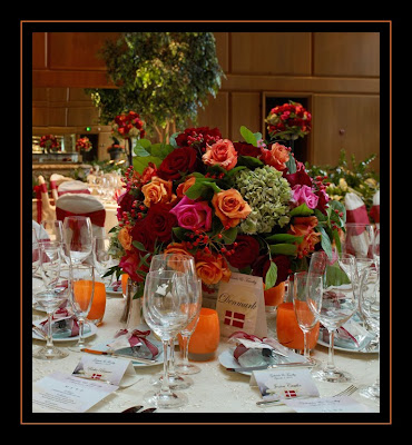
This last weekend we designed a wedding at the beautiful Fairmont Olympic. The room is filled with natural light and has ceiling at least 20 feet tall! I love designing for this space, which usually is an easy and fun task. In all honesty, I felt a bit challenged at first on this one, as the bride was very adamant about a color scheme of ruby red, tangerine and light pink, against a stark ivory backdrop. Usually I advise against strong colors against white or cream, as it can be harsh when not done just right. Our bride had fallen in love with centerpieces we had created at a past wedding, with lush autumn colors of ruby and persimmon, and she absolutely had to have them - but she really really loved pink, and insisted on adding that into the centerpieces. I suggested a rich fuchsia to match the vibrancy of the other hues, but she wanted a paler pink, so the search was on! I found a medium pink hue in the "Attache" rose, and let it play off of the orange and ruby tones, mixed in with some neutral green to fit in with the garden atmosphre of the space (the Garden Room at the Fairmont).

Being a more traditional bride, she also wanted cream linens, so we showed her lots of options that would create depth through texture, to avoid a flat, high contrast feel. She chose a perfect netted overlay with a hint of sparkle, from the always fabulous Wildflower Linens. Adding some texture to the linen made the contrast between the cream and the bold color much less severe, and made a nice transition from the tabletop to the height of the centerpieces. My favorite votive holders from Glassybaby looked amazing throughout the room!
The colors really came alive, and the special touches made all the difference. We were very lucky to have two great photographers there - we'll post photos from the night's official photographer Seattle's Azzura Photography as soon as they come in.

We were also really excited for our first opportunity to work with the incredible Philip Meadows, a photographer out of the UK (now living in Seattle). Philip is an amazing artist, and we were honored to have him shoot our designs!

The aisle pieces...

Centerpieces
Details: strung rose petals suspended from the centerpiece

One of our duchess rose bowls, individual petals layered by hand to create a larger, lush rose:

(all images copyright Philip Meadows Photography). Thank you Philip, for some beautiful images!

Overall, a successful collaboration between a bride's wishes and our design, don't you think?


Read more...

Friday, September 4, 2009

Floral Fridays: Orange and Gray Bridal Bouquet

It's September, and autumn is teasing us already - hints of rain, leaves falling... Autumn has always been a favorite season of mine, I love the crisp air, the smell of the leaves, and most of all, the stunning colors: I am pulled towards the joyful, warm hues like deep yellow, burnt orange, persimmon and ruby red...ah, the composition of it all! So inspiring. Gray was a really big color this year still (I LOVE gray), and I like how the gray plays with the orange hues in this bouquet - even though gray has usually been seen as more of a wintery color (especially when next to burgundy or cream). The bouquet has contrast, but in a unique way, not as harsh as red and cream, for example.

For all you wedding professionals joining me at "Engage09, the Encore" (A luxury Wedding Symposium), this one's for you - inspired by the "Poppy and Cement" color palette of this year's event!


I think the gray next to the orange adds a nice sophistication, and an element of surprise. What do you think? What new color palettes do you want to see this fall?

Read more...

Friday, August 7, 2009

Floral Fridays: The Scented bouquet

Ah, summer bouquets.  Often, when trying to get the perfect color combination, we floral designers use flowers created just for us in the floral trade - roses that last longer, orchids grown hydroponically (in water versus soil), etc.  In the summer, we have the opportunity to use flowers fresh from the garden, and what we gain is that amazing, intoxicating scent of romance.  This particular bouquet was the best smelling bouquet I have ever created! The bride, albeit in her 20's, wanted something old-fashioned, yet timeless; soft, gardeny, with gardenias, garden roses, sweet peas.  We were happy to oblige!  We called this our 'tea-stained' wedding, since she wanted everything with a just a hint of color; a blush of pink, a hint of beige, warm ivories and eggshell.

What stood out though, beyond the color palette, was that scent - the summery sweetness of the garden roses (that no standard rose can ever compare too!), the heady, rich perfume of the gardenias (my all-time favorite - hint to my husband!) the spiky scent of the sweetpeas and then that exotic tone of jasmine, which we wound through the edges of the bouquet, and which opened, bloom by bloom, throughout the wedding day.  I was worried that all these scents would compete, but mother nature knows best, and just like a perfectly layered perfume, this bouquet was complex and elegant in both hue and scent.  

We finished the bouquet off with our signature pleated ruffle, out of pink duppioni silk, since the brides gown had pleated ruffles on the bottom. Perfect!

Daniela


Read more...

Monday, June 15, 2009

The "After": Pink and more Pink Wedding

On Friday's "Before" post I showed you some pictures of the blooms we got in for Melissa and Nate's wedding. Well, the Wedding was a huge success, and everything turned out beautifully!
(Bridesmaids bouquets, above)

No one crashed into our van, so the lillies made it without creasing :) The ceremony was pretty, with smilax garlands and orchids cascading down from candelabras, adorned with peonies and lisianthus. The altar pieces were pretty and lush, and asymmetrical which looked great with the light coming in from the church windows.

The Reception was at the beautiful Edgewater Hotel, with it's amazing view and walls of windows! (If only you didn't have to load-in through the lobby!!) That feeling of being suspended over the water - so Pacific Northwest!

Melissa wanted both tall and low centerpieces, with a clean look but a lush feeling. To achieve this we used glass cylinders in two sizes, with the small ones lined with aspidistra leaves to focus on the flowers themselves and hides the stems and mechanics. The tall pieces rested atop tall cylinders, with hanging amaranthus coming down. All the centerpieces featured white spider Chrysanthemums (to get the feeling of the Dahlias she loves), luscious peonies and those lilies (Stargazers, Sumatra, and more)!
Although mums and lilies are often not used in more contemporary design, they worked well in this application -had we used bunches of greens with just lilies or the mums, the look would have been much different. We also added in some fun textures, such as fuchsia coxcomb, for a bright pop of color and shape.
Melissa, a very design-oriented bride, had fabulous paper items, such as table numbers and menus, as well as a fun popcorn bar and the cutest pink paper flowers on each napkin. We can't wait to see the professional photos from the talented Laurel McConnell, and share them with you! We'll share all the fun details, photos and sources. so stay tuned!

Daniela

Read more...

Saturday, January 10, 2009

Seattle Wedding Show

Specializing in event and wedding design in Seattle means keeping up on national and Seattle wedding trends, always trying to stay ahead of the curve; and when it comes to the Seattle Wedding Show, showcasing what we think will be one of the great color palettes for this year's weddings. As a top Seattle wedding designer, we feel it's imperative to be innovative and fresh, and to showcase not only our creativity but also products of Seattle wedding vendors whose work we adore, and even some out of state finds that we like to bring in.

Gray is a super favorite right now, and I was delighted to use it as a neutral for the backdrop of our booth this year - we had a ton of gray duppioni drapes we had custom made for Marissa and Dean's wedding, so we used those to drape our tent poles. Being stuck with using other non-flame retardant draping (The show required using certified flame-retardant fabric anywhere near a heat source such as lights or electricity) we used our slightly sheer voile (which is flame retardant) and draped both the ceiling of the tent and the back wall with it. Since white was not in my color scheme, we lit it up with some raspberry lighting to make the tent glow...


The overlay linens were from Wildflower Linens, featuring a Gray Shimmer linen and a beaded white lace overlay that shimmered in the light; a perfect neutral yet textured and glamorous way to bedeck the table. The fabulous corseted chiavari chair sleeves (in "Silver tinsel") were a HUGE hit with everyone, and they too, shimmered in the fuchsia light. Wildflower has a huge selection of chair caps, chair sleeves and of course, covers, and chair pads in ever color of the rainbow. We chose orange pintuck chair pads to match the napkins.


The underlay and other linens in our booth came courtesy of the fabulous Pedersen Rentals - I am simply in love with their new "sequin stitch linens" they come in a burnt orange and in this stunning blue green hue - absolutely fabulous, and incredibly affordable! Pedersen's also has THE best flatware and stemware in Seattle! We used their platinum stemware here, and their contemporary flatware - which I wish I owned...
The stationary was from the always creative Brown Sugar Design Studio - I don't know HOW many brides exclaimed their love over the crystal embellished table numbers, but if Brown Sugar should have had a lot of visits just based on that fabulous table number!


The centerpiece was dramatic, and full of tangerine and fuchsia blooms: lush roses, exquisite peonies, orchids, callas, etc mounded on top of clear fluted vase, and then sinously cascading down and around the vase, and trailing down off the tabletop...how fabulous would this be as a headtable centerpiece?

The talented Tania (Azzura Photography) AND the always amazing Janet (Janet Klinger Photography) stopped by and took some fabulous photos of our work, while Bradley Hanson of (Bradley Hanson Photography) did a whole photoshoot of both the tables and our bouquets. Even Kiro news stopped by to interview us! Everythign was VERY well documented!
Enjoy the images from Azzura and Janet Klinger, and we'll post Bradley's as soon as we receive them as well. It was a joy to meet all you wonderful brides, and even more fun in all the meeting's we've had this week with you! I am so excited about all the weddings we're working on this year. So far, we have everything from over the top tent weddings, lush Indian weddings, a few chic hotel weddings, some golf club room transformations and some lovely, highly romantic weddings in new venues.

It was also a plasure to reconnect with some of the fabulous vendors, and I highly recommend all the amazing talents we worked with. Enjoy the photos!


Read more...