Collaborating with the bride

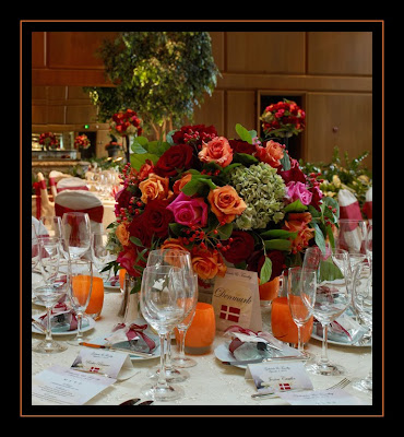
This last weekend we designed a wedding at the beautiful Fairmont Olympic. The room is filled with natural light and has ceiling at least 20 feet tall! I love designing for this space, which usually is an easy and fun task. In all honesty, I felt a bit challenged at first on this one, as the bride was very adamant about a color scheme of ruby red, tangerine and light pink, against a stark ivory backdrop. Usually I advise against strong colors against white or cream, as it can be harsh when not done just right. Our bride had fallen in love with centerpieces we had created at a past wedding, with lush autumn colors of ruby and persimmon, and she absolutely had to have them - but she really really loved pink, and insisted on adding that into the centerpieces. I suggested a rich fuchsia to match the vibrancy of the other hues, but she wanted a paler pink, so the search was on! I found a medium pink hue in the "Attache" rose, and let it play off of the orange and ruby tones, mixed in with some neutral green to fit in with the garden atmosphre of the space (the Garden Room at the Fairmont).
Being a more traditional bride, she also wanted cream linens, so we showed her lots of options that would create depth through texture, to avoid a flat, high contrast feel. She chose a perfect netted overlay with a hint of sparkle, from the always fabulous Wildflower Linens. Adding some texture to the linen made the contrast between the cream and the bold color much less severe, and made a nice transition from the tabletop to the height of the centerpieces. My favorite votive holders from Glassybaby looked amazing throughout the room!
The colors really came alive, and the special touches made all the difference. We were very lucky to have two great photographers there - we'll post photos from the night's official photographer Seattle's Azzura Photography as soon as they come in.
We were also really excited for our first opportunity to work with the incredible Philip Meadows, a photographer out of the UK (now living in Seattle). Philip is an amazing artist, and we were honored to have him shoot our designs!
The aisle pieces...
 One of our duchess rose bowls, individual petals layered by hand to create a larger, lush rose:
 (all images copyright Philip Meadows Photography). Thank you Philip, for some beautiful images!
Overall, a successful collaboration between a bride's wishes and our design, don't you think?


1 comments:
What a beautiful wedding! I absolutely love glassbaby and the rose petal detail is a perfect compliment to the centerpieces! Great work as usual :)
Post a Comment